Incarnating modernity and classiness with a touch of Scandinavia
CLIENT
Interfone
SECTOR
Communications
REGION
Singapore
YEAR
2015
EXPERTISE
Branding
Web Design
OUR ROLE
Brand research
Brand strategy
Brand identity
Brand tools
Context
Interfone is a Singapore registered company that provides voice & data roaming solutions for the enterprise, corporate and traveller markets.
For the launch of their latest product, they approached us with the requirement to refresh their brand.
We had 2 clear indications from Interfone. They wanted it to stand out by both incarnating modernity and classiness and they wanted us to have some Scandinavian reference in their logo as the CEO being originally from Denmark.
Approach
Contrary to popular belief, working on branding is not just a design effort. A branding project requires a systematic approach that includes research, strategy and design before implementing a cohesive identity to the company’s website, printed materials and communications system. At Pixel Tie, we adopted this 4-step approach to help our client.
Impact
Interfone has yet to see any quantitative results as they have not commence their online campaign. However, they really liked the simplicity of the logo as it could be easily applied to their social media artwork, presentations and even use it as an app icon. The new logo helps in positioning Interfone as a young & modern tech innovator.
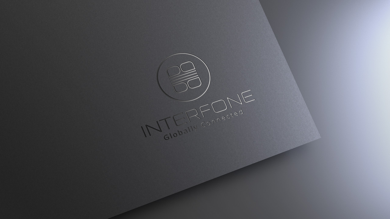
A logo that stick to user’s mind by representing the most important values of the company.
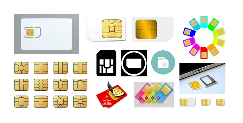
We started our researches on the form that would represent best Interfone’s main product. The trick at this stage was to not fall into a form that would ‘describe’ a chip like an icon would do. What seemed to be the most interesting was the curves inside the chip itself. Figurative enough to remind people of a chip but far enough from an illustration of a chip to fall into iconography.
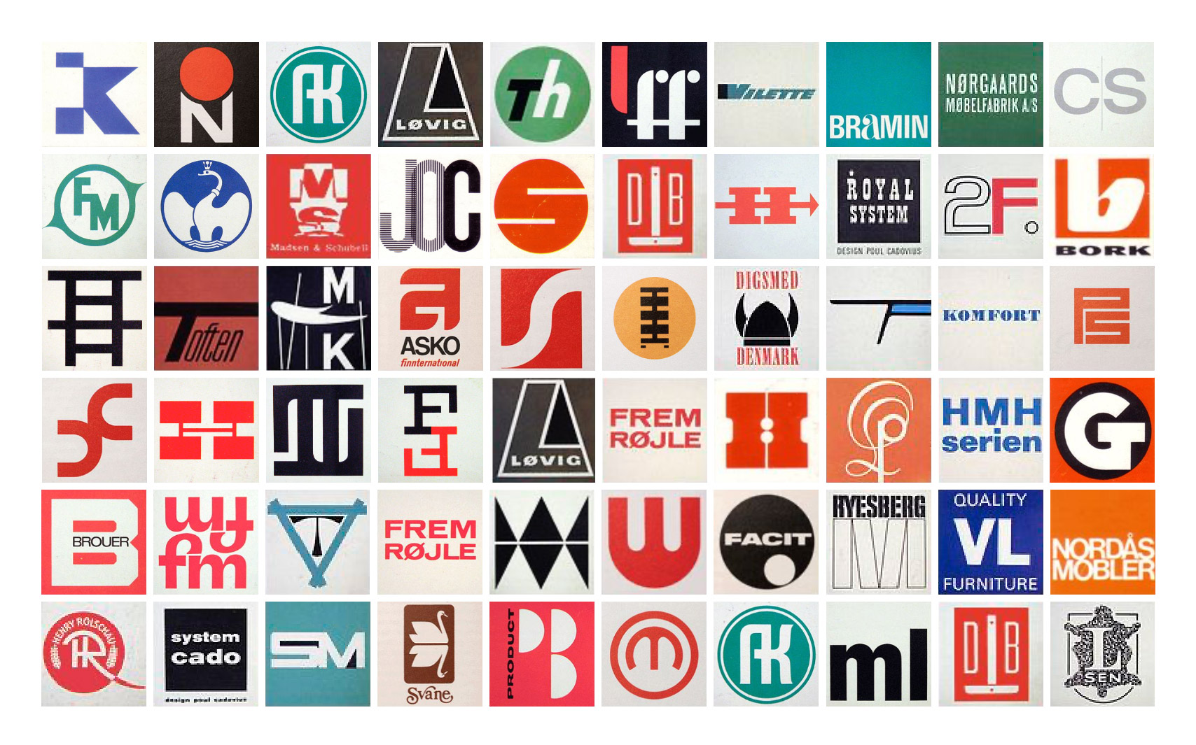
We also dived into the 1960s & 1970s Scandinavian logos design to see if we could use something from there to respect the second request from our client.
This design movement was characterized by the simplicity, minimalism and functionality. Our takeaway from these logos were also the way scandinavian designers were systematically playing around with font and geometry: most of these logos are embedded in a square or circle.
Once it was time to consolidate our research into the final designs, we stylized the chip - to treat it in a simplified and non-realistic way - with the goal to modernize it while keeping the foundation of the scandinavian logos design.
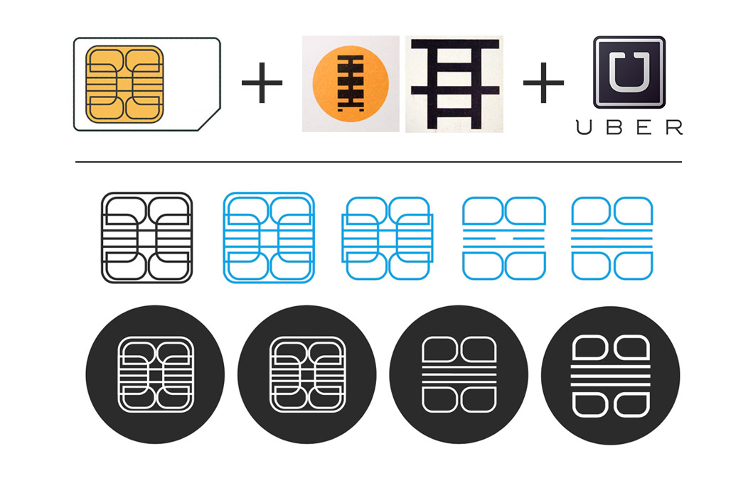
Finally, we applyed some font treatment to find an elegant and futurist one that would represent both our client’s industry and remind the scandinavian design.
Brand Guidelines to define standards on how the brand should be represented to the world.
The brand research was the first step in creating a standard for the brand. We did a customer and competitor analysis, followed by a current brand audit to have a better understanding of the situation and requirements.
From the above results, we identified the weakness and strength of the brand and kept them in mind to develop the Verbal System that is to be used in all their communication.
We also came up with a new tagline in which we encapsulated the essence of the brand: ‘Globally Connected’ – an expression of their goal in helping clients through their innovative call solutions, ensuring consistent quality and competitive calls for all their key stakeholders anywhere, anytime.
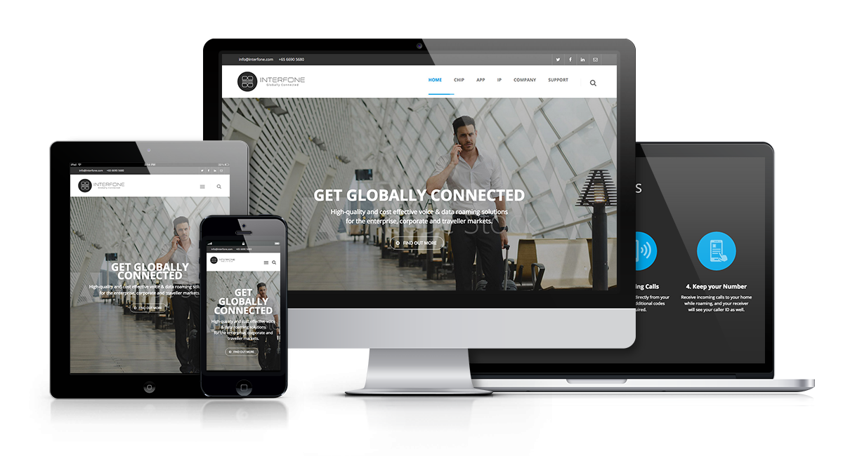
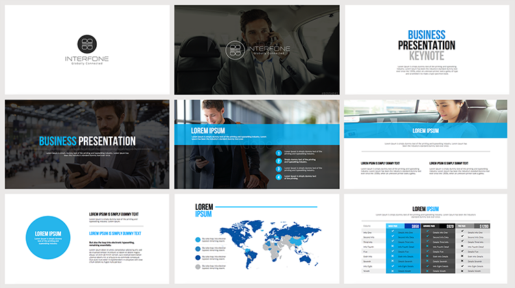
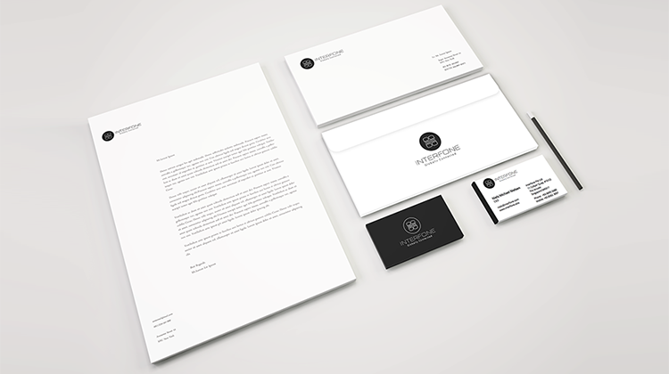
Marketing Collaterals
From this point, and after the client approval, we could start the implementation of a cohesive identity to the company’s website, printed materials and communications system.