
Most people would agree that providing a smooth and enjoyable user experience is something to always strive for, but examples of websites trying to meet some (often short-term) business objectives at the expense of user experience are not hard to find. It is possible to have endless discussions about whether it is going to hurt the business in the long run or the actual value provided might offset the negative experience, but maybe we should move forward by trying to find a compromise?
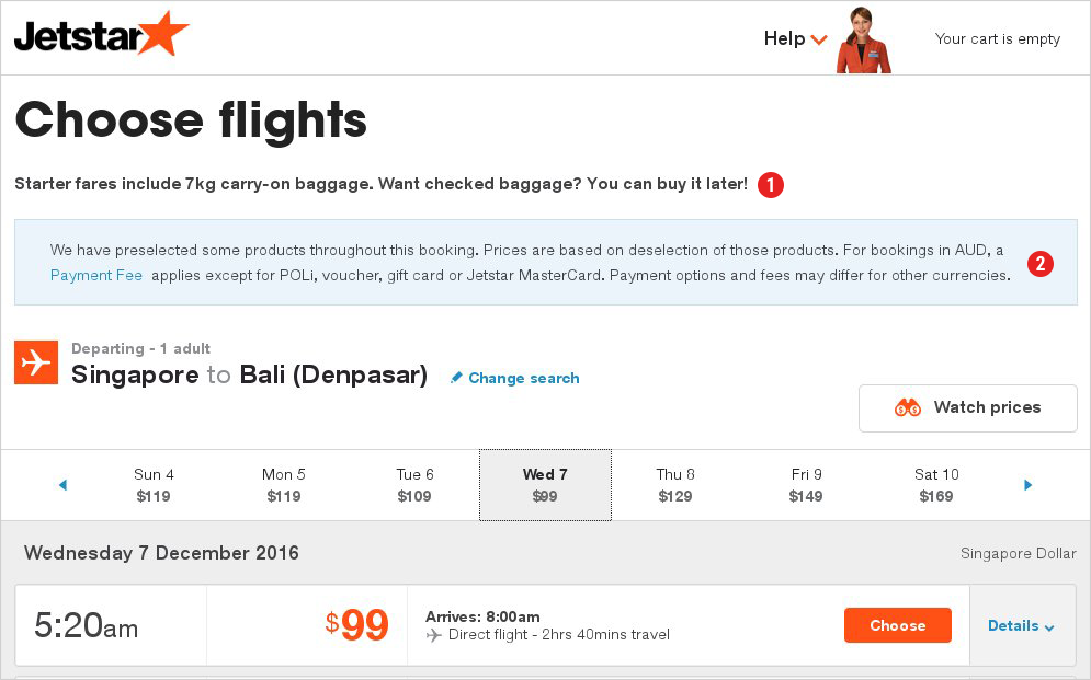
A good example of a less than excellent user experience being a part of a UX strategy is trying to book a flight with Jetstar Singapore. The process of searching for flights is well implemented – the destination and date selection is smooth, reasonable defaults are selected to speed up the process, no unneeded clicks are required. However, the perception of clarity and simplicity progressively diminishes after reaching the booking stage. Upon selecting a flight, the shown S$75 price quickly changes to S$109 – taxes and fees were not included in the initial price, which is something that, unfortunately, many airlines do.

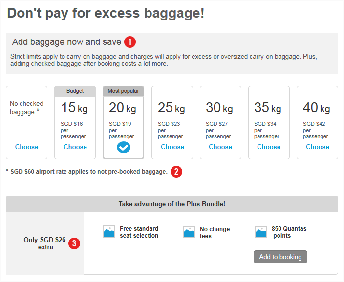
Users can also add bundles to get some extras at a reduced cost or just have the starter fare (which has a clear explanation that no checked baggage is included). Not sure if it is intentional or a design problem, but it takes a moment to locate the button for going to the next step – a big amount of text below the time selection section creates an impression that it is the end of the page (false floor), which may make users wonder whether they really have to select one of the bundles in order to proceed.
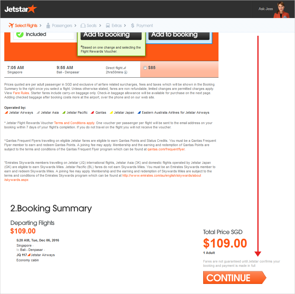
When reaching the next stage, the price changes from S$109 SGD to S$132 because an optional extra gets added – baggage, although no bundle has been selected to warrant that.

If a user notices it (some will not notice at this stage since it is not uncommon for users just to fill required fields and quickly go to the next page), it is not clear how, if at all possible, the added baggage can be removed. It requires some scrolling to reach the relevant section.

Upon reaching the next step, the price changes again – a seat has been pre-selected.
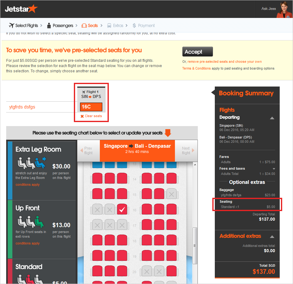
At least this time, the link for removing it is at the top, making it less frustrating to search for how to remove the added baggage. Not sure if many users will appreciate this attempt to save them some time since usually the benefit of selecting a seat is getting the seat that matches your preferences, not a system-selected seat.
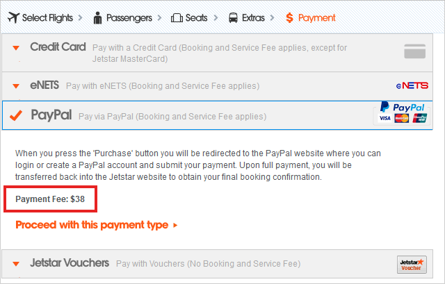
After going to the next step the price increases again because insurance is pre-selected. However, it is easy to find how to remove it. Finally, when reaching the payment step, a booking fee of S$9.50 per person per flight is required for card and Paypal payments (so it is S$38 if booking a return trip for two people), which comes as an unpleasant surprise because it is not avoidable.
The emotional state of a user is likely to go from an excitement of finding a low fare to feeling disappointed to find unexpected non-removable fees:

Users, who were not attentive during the booking progress and focused only on required fields would find a much higher price at the booking stage (S$155.5 if booking one flight for one passenger) and would need to go back and remove the extras, leading to an even worse user experience.
Of course, it is possible for users to leave once they see the final extra costs (either payment fees or payment fees + other extras), but many users would not bother dropping out and starting to search for flights elsewhere after they have spent some time on this website, provided all the details, thus would (potentially grudgingly) finalise the booking.
This lack of transparency is a major source of frustration. Users do not know at the beginning what the final amount is going to be, and it requires some effort from them to remove the extras they have not selected. Adding on to the fact that many users tend to stick to defaults, the way the UX is designed is used against them. Such practices are called dark UX patterns – misleading design practices that try to trick users to do what they might not do otherwise (this website is a good resource with examples of these patterns being used in various websites http://darkpatterns.org/). These patterns usually lead to short-term improvements in various website metrics, but they are likely to damage the brand image and trust in the long run. Besides, there have been some cases of companies being forced to stop such practices that attracted negative publicity, for example, an Irish budget flight company Ryanair was forced to remove pre-optins because of an EU regulation.
It is understandable why Jetstar does it – it is a low-cost airline and the flights are cheap because the airline charges for everything – better seats, food, baggage. It is the low initial cost what attracts users and showing the full cost with all extras and fees would not do the trick. It is actually great that budget travellers can remove all extras and still get a cheap flight and that the price is really flexible – travellers can pay only for the extras they need.
However, would it be possible to provide a great user experience and at the same time attract users with a low price and encourage them to add extras? This way, negative associations, which might hurt the company in the long run, would be avoided and users would feel treated with respect.
Jetstar’s Australian website (although this layout appears not on all devices) offers a more transparent booking process– the standard fees and taxes are included to the price and users are informed that some products are pre-selected and the price is based on de-selection of them. Besides, users are informed that a payment fee is charged and they can follow a link to find out how high it is.
It looks like a good compromise between adding items to a user’s booking and not misleading them, and the process is much more transparent, especially informing users about payment fees.
While users are informed about what is going on and feel a higher sense of being in control, unnecessary effort to remove extras is still required from the users’ side. Many users are accustomed to companies trying to up-sell by adding extras, thus they are unlikely to see the pre-selections as a way of trying to help them to save some time. A potentially better alternative would be to appear helpful by offering suggestions without trying to trick users – some items could be pre-selected, but users should be asked to confirm that they are happy with them. For example, selecting a seat and asking a user to confirm the selection is more likely to be perceived as sincere helpfulness than forcing a user to remove an unwanted selection.

Besides, users could be encouraged to select more extras by emphasizing the value they would get. For example, this can be done by stating how much they would save by adding baggage now by showing budget options or even having occasional special offers. On top of that, users could be more actively encouraged to consider bundles, especially when they select an extra that is a part of a bundle. For example, the S$45 bundle might be overlooked at the beginning (especially because it is hard to judge the value of it without seeing the prices of the extras separately), however, once users select 20kg baggage (costing $19 SGD), which is a part of the bundle, they could be reminded that for an extra S$26, they could get a better bundle with some additional extras – some users might reconsider not selecting the bundle. At each step, effort could be taken to make users consider extras and bundles by making them appear as a good value.
Of course, these are just a suggestions and one of many ways of implementing better UX designs. Without any actual data on travellers’ purchasing behaviour, there is no way of knowing what would work the best. However, making user choose extras by emphasizing their value instead of adding them against their will is highly likely to increase users’ satisfaction and create a more positive impression of the company. Replacing disappointment and the feeling of being tricked with an impression of helpfulness and transparency is more likely to work well in the long run by fostering a positive brand image, respect, credibility and trust. Tricking users can work only once, and for fussy customers, you might lose them for life.


